How to Implement White Labelling using React Styled Components Theme Provider

In the example of prop-tech — there is the desire to ensure the digital product servicing the building matches the look and feel of the company brand . In developing terms, the expectation is that the product can be fully customised per client.
This could be a tall order if it came in as afterthought in the product. The feature of fully customising the product per registered user group is something that would have to be built with intention and early on in the project.
Here is the guide of how to implement white labelling within React project, using React Styled components — ThemeProvider API. We are going to set up globally available styling context.
First, the project needs to have both styled components package and babel plug-in installed:


check that the .babelrc file (the name of babel settings file could be different) contains the following extension after the installs:

Next let’s Import the ThemeProvider component from styled-components and 1. wrap only 1 child component — the App. 2. pass the theme object via the theme prop ( theme={Theme} )

The following step is fun: define the themeOBJ as a javascript object that will provide the context for stylesheets and rendering.
In the picture bellow you will see that I chose to use 4 main sections: font sizes, colours, dimensions and bevels as the culprits informing the look and feel of the entire app. For example in the dimensions object I have declared the spaceUnit: 8(px) . this will become the ‘building block’ upon all other dimensions lay in most cases. There still are the unique measurements defined for items such as the Header hight and so on. Just create your own theme with your own definitions :]

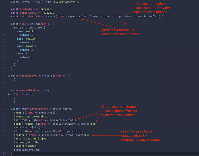
with app wrapped by ThemeProvider component and themeOBJ passed into it as theme prop, we can start pointing to the theme by calling props.theme in our styled component definitions.
In the example bellow we are defining a StyledButton with style attributes such as border-radius.
Rather than hardcoding the pixel value of 8px, we are pointing to the theme prop which contains the definition of the border-radiuses (bevels), which in my case looks like props.theme.bevels.button.
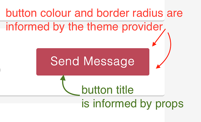
by looking in the image below you might also notice that not all of the values point to the theme provider — some are just referencing other passed props. define what needs to reference universal ‘source of truth’ (the theme) and what doesn’t based on the project needs (see the example of the ‘send message’ button bellow)
the benefit of using mixed theme and props values is , that we keep the content of the button specific to the context, by passing props (for things like button title, onClick action etc.) yet the button now has the possibility to transform its look and feel to the context provided: we can display to two different brands which would have distinctly different looks
In the button pure component file we would import the styled component and pass props as normal:

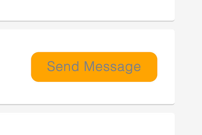
So to see the switch in action, lets take a look first at the button as a small component example that would need to change the look and feel based on branding guidelines:
and after tweaking only one file — the themeOBJ , bevels, colours and other features we see the newly rebranded button! this themeOBJ file could be given to the design who doesn’t know much of coding, and he would be able to have full control and effect on the branding implementation
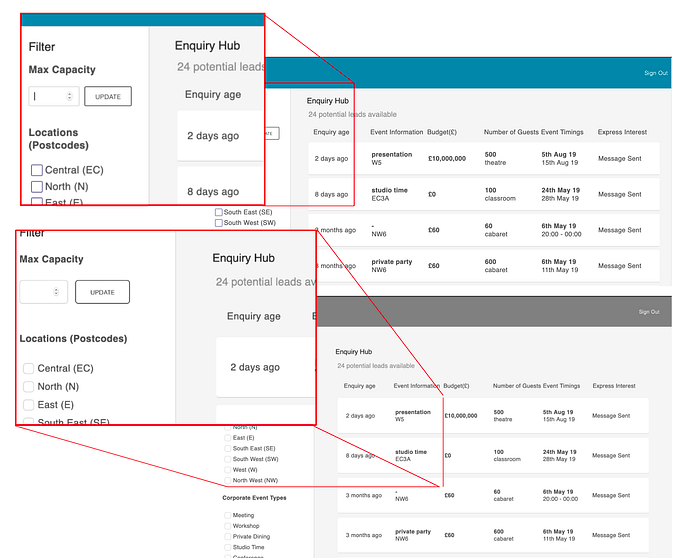
And here is the example of how rebranding a page could look like:
the themeOBJs could be saved for each client in database, then matched and loaded upon the login of the client, voila! :]


